
Site analysis of Stiletto Sports
Stiletto Sports
For a newbie, learning a new sport can be quite overwhelming. First, you have to learn the rules, then the positions, the teams, and it can go on and on. So when you visit a site to research the wonders of sports, stepping into an unorganized and confusing site will leave you unmotivated to continue.
In comes Stilettosetsport.com, a site that dedicates itself to placing a woman’s spin on sports. The author of the site, Jennifer Taglione, covers football, baseball, basketball, along with other sports.
Content
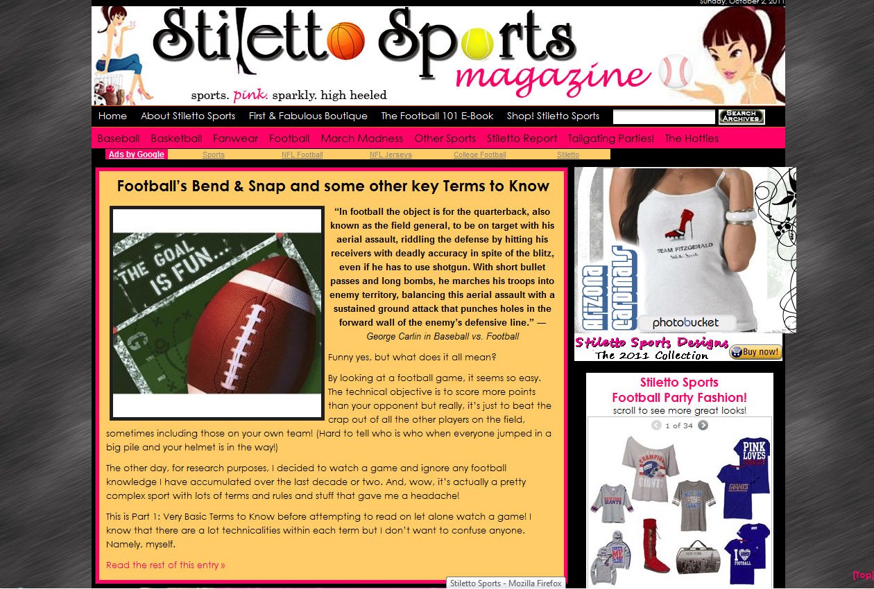
Reading Taglione’s site is like talking to a girlfriend. She explains the game without causing a headache about all the technicalities. Tagilone does a great job with the content of the site. Not giving too long post and not over loading the reader with too many unknown terms. She even gives you recipes for halftime.
Tagilone has great content to explain the sports but does not include a separate vocabulary list that includes common terms used in each sport. It would be helpful to be able to refer back to words without searching through a particular post.
Another problem on the site is the combination of information with the links for merchandise. Instead of having the content and main purpose of the site mingling with merchandise, they should be separated into two clear, defined spaces.
Navigation
The one thing lacking on the site is a clear navigation and layout. The navigation bar is located in the expected place but the subjects are in alphabetical order which seems odd. “Fanwear” sits in between “Football” and “Basketball”. While a visitor to the sitecan find the information they need, it would involve a little thinking to understand the organization of the site. The organization of the site appears to be random and unplanned. The naming convention used for the articles seem too long and I would have liked a more simplistic title for most of the articles.
There is also a lack of links outside of the site. For one, Taglione does not link back to ESPN.com or even the NFL.com in her site. The only place where she links to a site outside of hers is to Halftimedesigns.com for an outfit for the Super Bowl game.
The plus side of the navigation is the navigation bar can be seen throughout the site so finding your way back home will not be too hard.
Appearance
Taglione has some custom graphics on the site. One of my favorites is the football cleat turned into a stiletto. The stiletto can be seen throughout the site on merchandise and even incorporated on the social networking links. But I wonder why she didn’t include it anywhere in her header. Instead she uses a boot in the header as the “l” in the Stiletto.

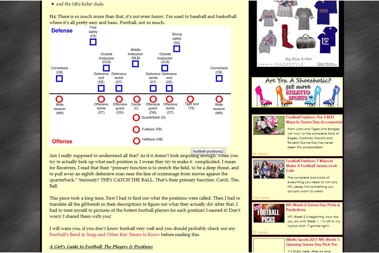
The graphics she uses to explain the different field positions and penalties are clear, easy to understand, and follow. However some of the other graphics are distracting and not well used. Some appear fuzzy and takes away from the aesthetics of the site. When it comes to accessibility, the site lacks alternative tags for the images on the site.
The most trouble part of the site visually is the right side bar that includes Google ads, social networking links, links to the site’s merchandise store, and information about recent articles. The eye is immediately drawn to the slideshow at the top right hand corner. Along with the header and subheader, the site seems packed with irrelevant information that is quite overwhelming to the eye.
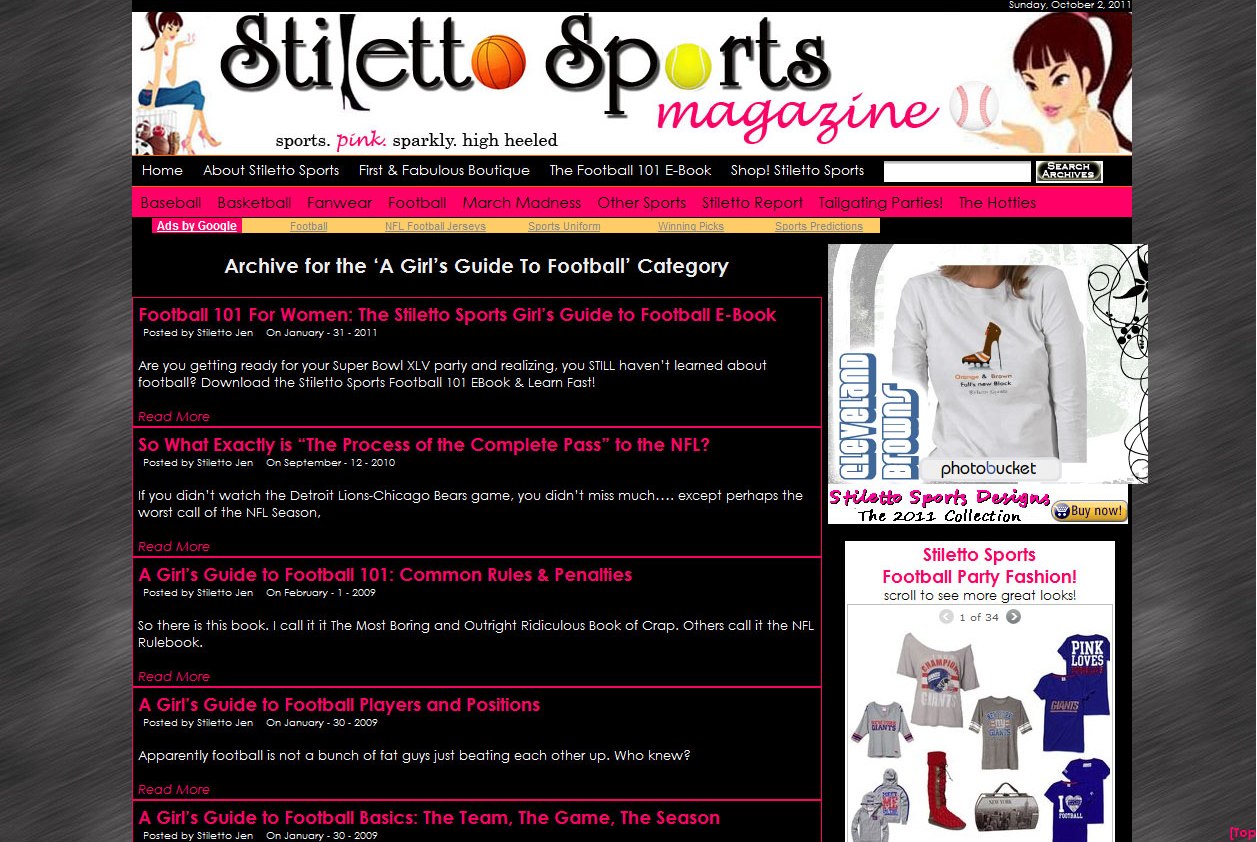
Taglione uses pink, black, white, and yellow as the main colors on her site. While pink makes sense as a color on the site. I’m still wondering why she chooses yellow as the background for her text. It doesn’t make the text difficult to read but it would look better in white. Another poor use of color is seen when you click “A Girl’s Guide to Football”. It brings up a page with all the topics discussing the game. The list mimics a search instead of a topic list. The black background with the pink and white text appears amateurish. A use of less color would pull the site together and take away the “busy” look of the site.
Conclusion
With the content of the site, it's no surprise that Taglione's page is so popular. The language used is inviting and easy to understand. However, Taglione's site could use some reorganization of their information and changes to the overall design. With these changes, she could grow her site beyond its current audience, make it easier for her users to navigate, and display an aesthetically pleasing design.